〰️
Interaction Design
〰️
UX/UI
〰️
Branding
〰️
UX Research
〰️
Product Design
〰️ Interaction Design 〰️ UX/UI 〰️ Branding 〰️ UX Research 〰️ Product Design
Hyasynth
Project Overview
Dealing with a new medical diagnosis can be overwhelming, despite the availability of several tools to help. Navigating the complexities of the medical system can be stressful and confusing, especially when dealing with the emotional and mental fallout of an unforeseen medical diagnosis. Patients would benefit from an integrated healthcare software that delivers physician-created guidance and insights consolidated from medical platforms and patient portals. Our application can help patients prioritize their next steps in a convoluted process, make them aware of opportunities they might not know are available, and provide them with the information they need to become well.
My Contributions
In the first part of the course, we were in groups of four, so three other members of my team equally contributed to the sections. Everything from that point forward is an individual project and solely designed by me.
Problem Statement
With all the stress that comes with modern life, a medical diagnosis can make it all the more complicated. People may need to navigate how to care for their loved ones in new ways such as understanding treatment options and directing friends and family how to help. They also might have questions like how to cope with change and uncertainty, and how to figure out a new normal.
Basic Info
Client: This project is for my Certificate in UX & Visual Interface Design at the University of Washington.
Date: 2023-2024
Methods
Interviews
Wireframing
Paper Prototyping
Brainstorming
Tools
Balsamiq Wireframes
Figma
Otter.ai
Mural
User Interviews
Our team conducted 16 total interviews. Each individual interviewed was someone who either had a diagnosis themself or a loved one with a diagnosis.
16
Interview Participants
20
Questions per participant
320
Individual
Data Points
Competitive Analysis
Through our competitive/comparative analysis, we gained a better understanding of what is currently offered in the market, learned the key product features and functionality employed to support the user experiences, researched digital and non-digital experiences to inspire new opportunities for products and services, and identified user expectations.
Personas
The Navigator
The Navigator takes charge of their care plan and the care plan of those they care about. They feel uncomfortable waiting around for things to just happen. They want to ensure that their health and the health of their loved ones is top priority.
The Responder
The Responder responds to information vs. seeking it out. They either weren’t taught medical literacy or don’t know where to look for it, but generally, this person is unintentionally uninformed and overwhelmed. Their primary goal is to better understand their care within the limits of their capabilities.
Journey Maps
After setting our personas, we were tasked with mapping out the user’s journey and discovering how each archetype experiences the problem statement. We wanted to create a shared understanding of the mindsets, thoughts, and emotions of our users throughout a chronological journey.
Solution Brainstorming
We tapped into our creative minds to find the best solutions for our users to this problem. We came up with these categories for our solutions:
Community-building
Emergency Support
Organizing tools
Efficiency
Emotional Support
Crowdsourcing Support
Status Tracking
Gamification
Clarity
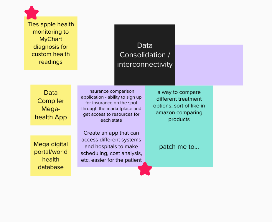
Data Consolidation/Interconnectivity
Solution
Out of all the possible solutions available, interconnectivity resonated with me the most. My project involved developing an application that would bring all the major players in the healthcare industry onto a single platform through API integrations and well-thought-out design.
Initial Wireframes
After conducting research, I was tasked with creating initial wireframes in Balsamiq.
I highlighted a few key features in my initial wireframes:
Messages
Medication Reminders
Medical ID
Connections
Concept Testing
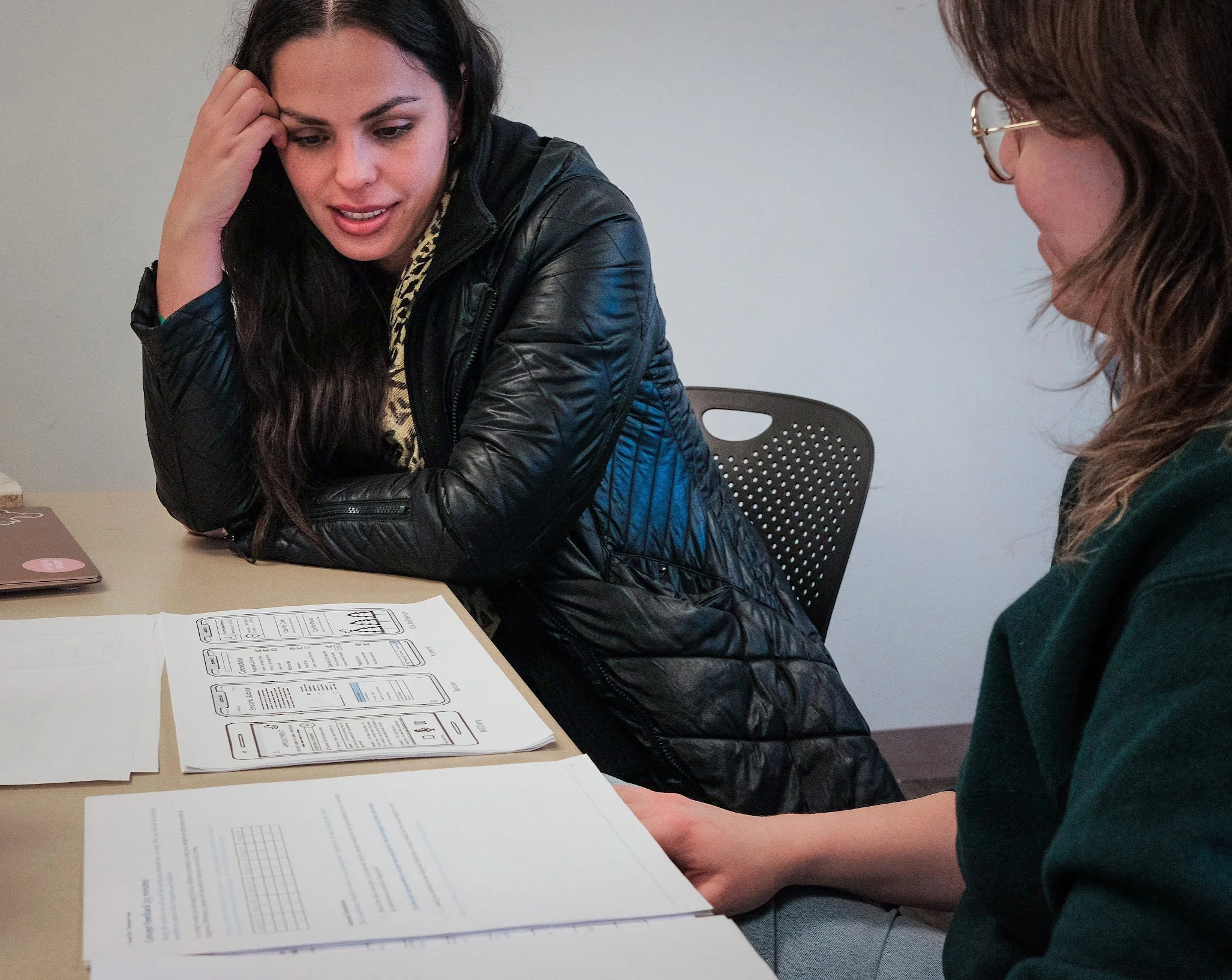
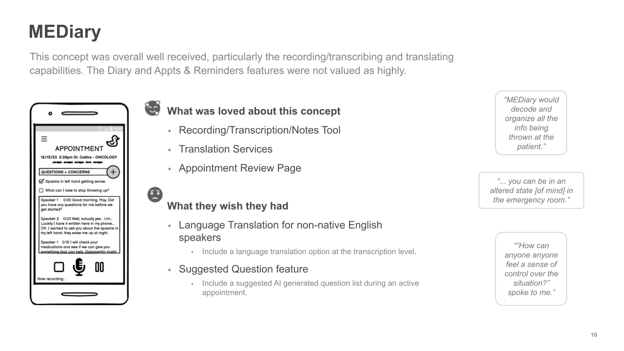
After finalizing our initial ideas, we conducted tests on our four Minimum Viable Products (MVPs). These tests involved guiding users through various scenarios and concepts to determine which solutions were most effective in addressing user issues and to identify the most appreciated concepts and features.
We carried out six testing rounds for each concept with different participants to gather qualitative feedback. At the conclusion of these concept tests, each participant was asked to fill out a survey.
MVPs
Key Findings
Visit Frequency
In our sample, fewer people went to the doctor than anticipated - many because of financial, emotional (fear), or other reasons.
Prior Knowledge
The more control, clarity, and expectations users have, the more comfortable they are before seeking care.
Information Overload
Medical information can be overwhelming, and tools that help explain, track, or highlight info are highly valued.
Support Networks
Emotional support features should prioritize growing and organizing a support network.
Language Support
Users would love the ability to translate medical transcriptions from English to different languages in real-time.
Finances
Finances were often foremost on the users’ minds, particularly when contemplating going to the doctor.


